
Titans uniforms are an example of bad taste
The Tennessee Titans unveiled their new uniforms on Wednesday night in front of a large crowd in Nashville, and the result was unfortunate. The crowd seemed generally happy with the outcome (a concert and booze will do that). However, the uniforms missed the mark for anybody with a working set of eyes.
Tennessee hasn’t changed the uniform set much since it moved to the city from Houston. Since, they’ve changed the name from Houston Oilers to Tennessee Oilers, and then eventually Titans. Once the rebranding was complete, things have stayed the same, until now.
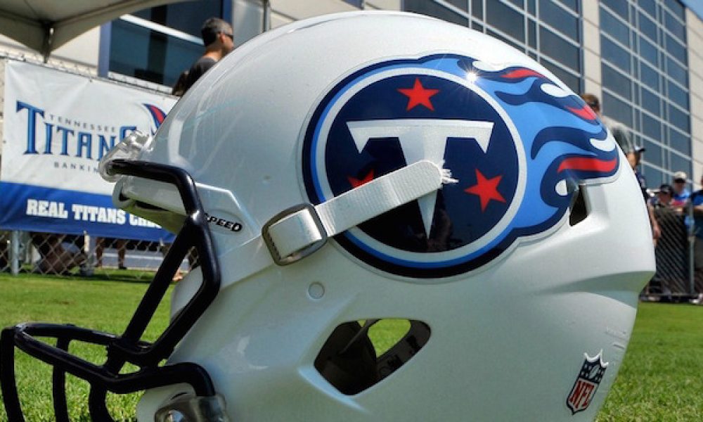
The white helmets are no longer a part of the uniform. Instead, the Titans are now going with a deep blue look that includes a fading stripe down the middle. The logo on each side of the helmet is the same. Although the different color almost makes the emblem blend in to some degree, muting its effect.
However, the worst part of the kits are the numbers on the uniforms. The font is very sharp, and while it might give off the look of Greek lettering — one can assume that was part of the idea — it takes the team look like it is playing in high school or a semipro league. In short, the Titans had a chance to rebrand and usher in a new era of football with a sweet uniform. Instead, they look like a sideshow.
Want $250 to bet on NFL Futures?
Sign up today!
Frankly, it’s tough to understand why the change would be made so drastically. Tennessee never had one of the best-looking uniforms in the league by most measures, but it certainly was respectable. While it’s true that new things take an adjustment period, these look to have missed the mark.
On the positive side, the Tennessee Titans did keep their logo. At least we can tie that back to the rest of the franchises history in Tennessee. The team also has nice colors with dark blue, a touch of red and white, saving us from a complete disaster.
In recent years, most of the NFL redesigns have raised some eyebrows. For instance, the Tampa Bay Buccaneers went from Pewter Power to looking like an alarm clock, once again because of those damn number fonts. Additionally, the Cleveland Browns deiced to slap the city name over the numbers on the front of the jerseys, because apparently nobody realized what city the team played in. Then again, that has nothing on the word BROWNS being on the pants underneath the stripe. Those are so bad, the team is already considering the best way to revamp them come 2020.
The Tennessee Titans could have done worse, but it most-certainly could have done much, much better.
