5 NFL teams that should change their uniforms
5. Cleveland Browns
The uniforms the Browns are wearing today are a complete disgrace. Cleveland had some of the simplest yet best uniforms back in the 1960s, really all the way until a few years ago. Then the team decide the helmet and to be a new shade of orange, and that the pants needed to say Browns on them. Also, get rid of “CLEVELAND” across the chest. One of the great, classic looks in the NFL was completely bastardized here.
4. New England Patriots
The Patriots have enjoyed a ton of success in their current uniforms, so they probably aren’t going anywhere for quite some time. Still, who doesn’t miss those old sets that had Pat Patriot on the side of the helmet? Additionally, those old-school red tops with the striping down the sides? Those were fantastic. The current uniforms are some of the ugliest in the NFL, but the Patriots get away with it because they just keep on winning.
3. Cincinnati Bengals
Why did the Bengals ever change anything from the original look? Sure, the helmet was incredible bland with only the word “BENGALS” written across one each side, but the colors were crisp and the uniforms were clean. Now, there is all this weird striping on the jersey and the numbers are a bit strange. Hell, the Bengals could even go bad to the Boomer Esiason era where the stripes went all the way down the pants.
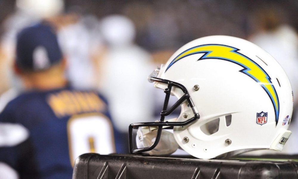
2. Los Angeles Chargers
This isn’t a commentary so much on the current uniforms are but simply how great the powder blue look is. The Chargers have to go back to the uniforms they had when they were dominating the American Football League with stars such as Lance Alworth, Ron Mix, Paul Lowe and John Hadl. There’s a legitimate argument to be made that no uniforms in the history of the NFL has ever looked better than those bad boys. The current set is fine, but why settle for fine when you have the proverbial GOAT jersey sitting on the back burner.
1. Tampa Bay Buccaneers
This had to be the easiest call ever. Right now, the Buccaneers are running around looking like a bunch of human alarm clocks. The number font is terrible and the logo on the helmet is way, way too big. The Buccaneers should be going back to Bucco Bruce, which was the original mascot for the team’s first 21 seasons. At the same time, bring back that color scheme, embrace the Creamsicle, and be done with it. Those are classic threads for a reason.


