Browns Find Innovative Way to Disappoint Fans with ‘New’ Logo
Last week, the NFL world was up in arms over the announcement that the Cleveland Browns franchise was preparing to deploy its 2015 logo, signalling a new era for football in the sports-crazed state of Ohio.
With the new designs now public, the verdict is decidedly…well, undecided, due in no small part to the fact that there is nothing to decide upon. After a week of unmitigated hype over the potential innovations to one of the league’s most historical names, the fresh logo did, in fact, represent the Cleveland Browns to a tee, but for all the wrong reasons.
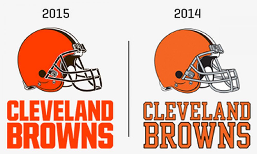
Like the Browns themselves, the redesign promised so much on paper, but delivered so little in reality. The uninspired orange helmet remains, with the only differences being a fresh coat of paint that is ‘brighter and richer, and matches the passion of Cleveland fans’, as well as a new brown facemask that ‘represents the strength and toughness of Cleveland.’
Now, reflect on those nonsensical statements and remember that somebody was paid to write them. In what world does brown represent strength and toughness? Certainly not the world in which the franchise sporting that very color has spent the last fifty years as the laughing stock of its competition.
The end result is a logo that looks more like a cheap knock-off from the local Chinese markets than a professional design laboured over for an entire season.Â
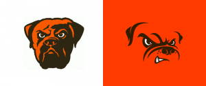
But helmet aside; the true travesty lies with the alternate logo. What was once a menacing, grizzled beast designed to reflect the verocity of the team and its ravenous fans has been neutered. The new look bulldog is perhaps the least intimidating mascot in sports, punctuated by the same nauseating shade of neon orange as the helmet.
For the Browns, the significance of change on the field far outweighs change off it, but if the fresh logos are any indication, it’s shaping up to be another season of disappointment in the Dawg Pound.


